Creating Animated CSS Gradients That Move
Learn how to apply animations to CSS gradients to create dynamic background effects.
Bringing Static Gradients to Life
Have you ever visited a website and noticed the background subtly flowing, or seen a spreading light effect when hovering over a button? Most of these effects are created using CSS gradient animations. The challenge is that CSS gradients don't directly support animation. But as always, creative web developers have found workarounds, and today we'll explore these secrets together.
The core principle of gradient animation is surprisingly simple. Instead of moving the gradient itself, you move the position or size of the background where the gradient is applied. It's like slowly moving a long scroll painting behind a window - the scene visible through the window changes as you move it.
Background Position Animation: The Most Practical Approach
The most widely used and performant method is animating the background position. First, set the gradient size larger than the actual element, then move the background position to make it appear as if the gradient is flowing.
.animated-gradient {
  background: linear-gradient(
    -45deg,
    #ee7752,
    #e73c7e,
    #23a6d5,
    #23d5ab
  );
  background-size: 400% 400%;
  animation: gradient-shift 15s ease infinite;
}

@keyframes gradient-shift {
  0% {
    background-position: 0% 50%;
  }
  50% {
    background-position: 100% 50%;
  }
  100% {
    background-position: 0% 50%;
  }
}
The magic key in this code is background-size: 400% 400%. By making the background 4 times the original size, when you move the background position from 0% to 100%, only a small portion of the gradient is actually visible. As the position slowly changes over 15 seconds, colors transition smoothly. This technique works particularly well when applied to hero sections on landing pages or login screen backgrounds to add an elegant feel to your site.
Creating a Loading Indicator with Rotating Conic Gradients
Conic gradients pair perfectly with rotation animations. Since colors spread out rotating around a center point, rotating the entire element creates a natural animation. This technique is especially useful for creating loading spinners or progress indicators.
.rotating-gradient {
  width: 100px;
  height: 100px;
  border-radius: 50%;
  background: conic-gradient(
    from 0deg,
    #667eea,
    #764ba2,
    #f97316,
    #667eea
  );
  animation: rotate 3s linear infinite;
}

@keyframes rotate {
  from {
    transform: rotate(0deg);
  }
  to {
    transform: rotate(360deg);
  }
}
By setting the start and end colors to be identical, the colors connect seamlessly during rotation, creating a smooth loop. Using the linear timing function is also important because constant speed rotation looks most natural.
CSS Houdini: The Future of Gradient Animation
With CSS Properties API (also known as CSS Houdini), true gradient animation becomes possible. You can define custom CSS properties and apply animations to them. While not yet supported in all browsers, more and more browsers are adding support, making this a technology that will become standard in the near future.
@property --gradient-angle {
  syntax: "<angle>";
  initial-value: 0deg;
  inherits: false;
}

.houdini-gradient {
  background: linear-gradient(
    var(--gradient-angle),
    #667eea,
    #764ba2
  );
  animation: angle-rotate 3s linear infinite;
}

@keyframes angle-rotate {
  to {
    --gradient-angle: 360deg;
  }
}
The @property rule declares a custom property called --gradient-angle and tells the browser that this property holds an angle value. This allows the browser to interpolate this value, enabling smooth animation. It looks as if the gradient direction is rotating in real-time.
Practical Project: Neon Glow Button
Let's combine the techniques we've learned to create an interactive button you can actually use. This creates a neon light flowing effect around the button. You can often see buttons like this on gaming sites or tech startup landing pages.
.neon-button {
  position: relative;
  padding: 15px 30px;
  color: white;
  background: #1a1a2e;
  border: none;
  border-radius: 10px;
  font-weight: bold;
  cursor: pointer;
  overflow: hidden;
  z-index: 1;
}

.neon-button::before {
  content: '';
  position: absolute;
  inset: -3px;
  background: linear-gradient(
    45deg,
    #ff0080,
    #7928ca,
    #ff0080
  );
  background-size: 200% 200%;
  animation: glow 2s linear infinite;
  border-radius: 12px;
  z-index: -1;
}

@keyframes glow {
  0%, 100% {
    background-position: 0% 50%;
  }
  50% {
    background-position: 100% 50%;
  }
}
The key is using the ::before pseudo-element to create a gradient layer slightly larger than the button. inset: -3px makes it 3 pixels larger than the button on each side, and z-index: -1 places it behind the button. This allows the gradient to peek through at the button edges, creating the glow effect.
Optimizing for Performance and Accessibility
While animations are visually appealing, they're not a good experience for everyone. Some users are sensitive to moving elements, and excessive animations can cause performance issues on lower-end devices.
From a performance perspective, transform and opacity properties are most efficient as they benefit from GPU acceleration. background-position animation also works well in most situations, but adding will-change: background-position allows the browser to prepare optimizations in advance.
For accessibility, you should always consider the prefers-reduced-motion media query. If a user has selected reduced motion in their system settings, it's best to disable animations.
@media (prefers-reduced-motion: reduce) {
  .animated-gradient,
  .rotating-gradient,
  .neon-button::before {
    animation: none;
  }
}
This way, users sensitive to motion can browse the website without discomfort, while others can still enjoy rich visual experiences.
Wrapping Up
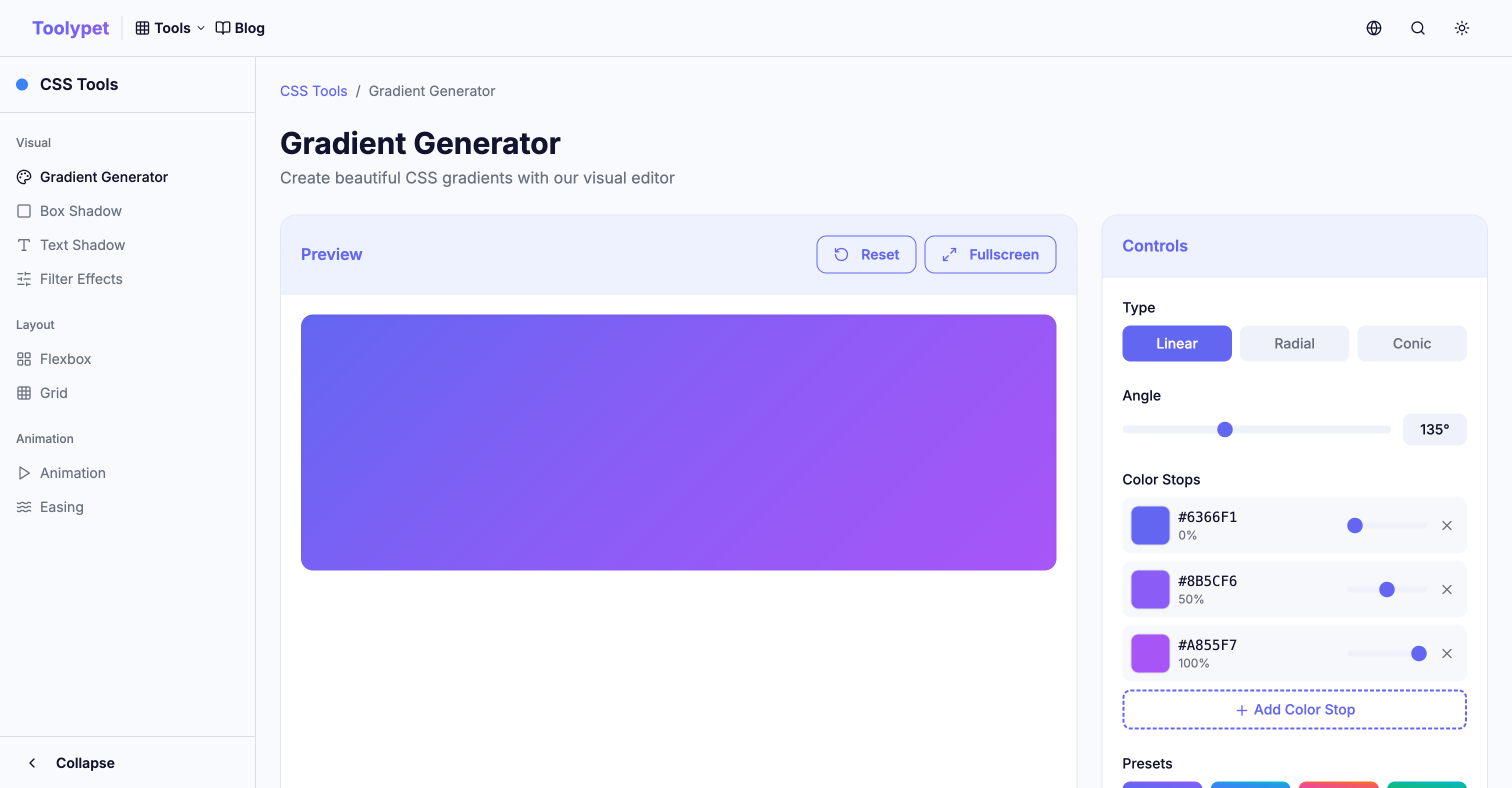
CSS gradient animation is a powerful technique that can breathe dynamic life into your website with relatively simple code. Create a color combination you like with Toolypet's Gradient Generator, then apply the animation techniques you learned today. When your static gradient comes alive, your website will become that much more special.