CSS Gradient Fundamentals: A Complete Guide to Linear, Radial, and Conic
Understand the three types of CSS gradients and learn how to create beautiful backgrounds.
Welcome to the World of CSS Gradients
Few technologies in web design history have brought such dramatic changes as gradients. The beautiful color transition effects that once required creating images in Photoshop for backgrounds can now be achieved with just a single line of CSS code. CSS Gradient is a powerful feature that creates smooth transitions between two or more colors and has become an essential tool in modern web design.
The biggest advantage of gradients is performance. Using image files causes additional HTTP requests and loading time proportional to file size, but CSS Gradients are rendered in real-time by the browser, so the file size is virtually zero. They also display perfectly sharp at any resolution, making them even more valuable in the era of retina displays.
Characteristics and Uses of the Three Gradient Types
CSS provides three types of gradients. Understanding each one's characteristics lets you choose the optimal effect for your situation.
Linear Gradient: The Elegance of Straight Lines
Linear gradient is the most widely used form. As the name suggests, colors transition smoothly in a straight direction, and it can be applied to various elements like buttons, backgrounds, and overlays.
background: linear-gradient(90deg, #667eea, #764ba2);
When specifying angles, 0deg goes from bottom to top, and 90deg goes from left to right. If this feels unintuitive, you can also use direction keywords like to right, to bottom, or to top left. Personally, I often use 135deg because a diagonal gradient flowing from top-left to bottom-right feels natural yet dynamic.
Radial Gradient: Light Spreading from the Center
Radial gradients spread colors outward from a center point, like a spotlight. They're particularly useful for adding depth to backgrounds or creating pressed effects on buttons.
background: radial-gradient(circle at center, #667eea, #764ba2);
circle creates a perfect circle, while ellipse creates an ellipse matching the element's proportions. You can freely specify the center position, using at top left to create an effect of light shining from the upper left, or exact coordinates like at 30% 70%.
Conic Gradient: A Festival of Rotating Colors
Conic gradient is the most recently added type to CSS, where colors change while rotating clockwise around a center point. It might feel unfamiliar at first, but once you understand its characteristics, you can create effects like pie charts or color wheels with pure CSS alone.
background: conic-gradient(from 0deg, red, yellow, green, blue, red);
Setting the start and end colors to be identical creates a circular gradient that connects smoothly. This technique can also be used to create loading spinners or progress indicators, making it useful in many situations.
Precise Control with Color Stops
By default, gradient colors are distributed evenly. But sometimes you need a specific color to occupy a larger area, or you need an abrupt transition. Color stops allow you to precisely control the position of each color.
background: linear-gradient(
  90deg,
  #667eea 0%,
  #667eea 30%,
  #764ba2 70%,
  #f97316 100%
);
In the example above, the first color is maintained from 0% to 30%, then transitions to the second color afterward. Specifying the same color consecutively maintains that solid color without any transition in that section. This technique can also be used to create hard-edge gradients (where colors change abruptly).
Ready-to-Use Practical Examples
Now that we've learned the theory, it's time to put it into practice. Here are two of the most commonly used patterns.
Sleek Gradient Buttons
Even in today's world of flat design, gradient buttons remain popular. They're particularly effective for CTA (Call-to-Action) buttons that need to catch the user's attention.
.gradient-button {
  background: linear-gradient(135deg, #667eea 0%, #764ba2 100%);
  border: none;
  color: white;
  padding: 12px 24px;
  border-radius: 8px;
  cursor: pointer;
  transition: transform 0.2s, box-shadow 0.2s;
}

.gradient-button:hover {
  transform: translateY(-2px);
  box-shadow: 0 10px 20px rgba(102, 126, 234, 0.4);
}
Adding a hover effect with a slight upward floating animation and shadow makes the button feel alive and responsive.
Eye-Catching Text Gradients
Applying gradients to hero section titles or brand logos can create a powerful impression. It requires a small trick, but the result is impressive.
.gradient-text {
  background: linear-gradient(90deg, #667eea, #764ba2);
  -webkit-background-clip: text;
  -webkit-text-fill-color: transparent;
  background-clip: text;
}
This approach clips the background to only the text area and makes the text color transparent. It works well in all modern browsers and is especially striking when applied to large headings.
Wrapping Up
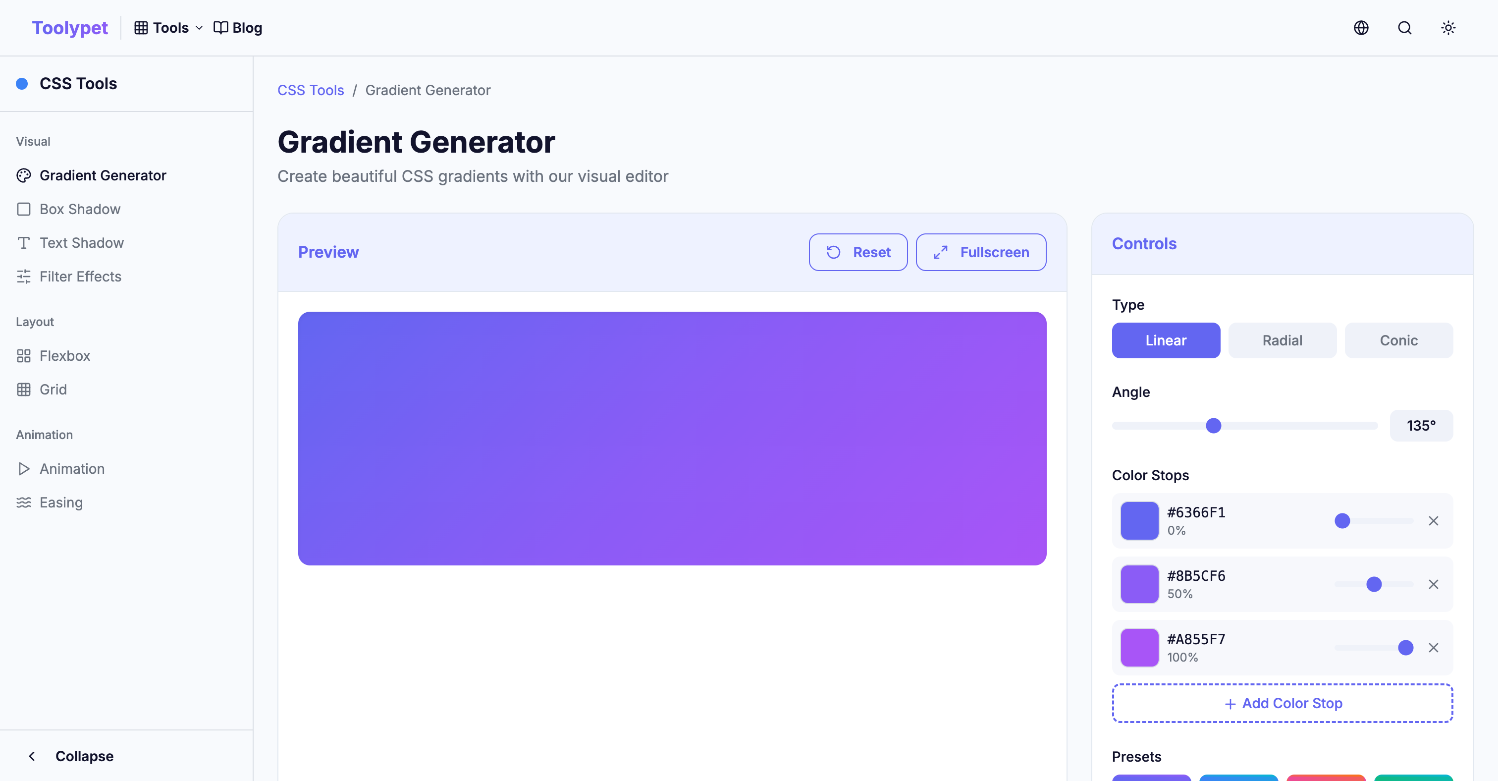
CSS Gradients may seem simple, but they hold endless possibilities. Once you firmly understand the basic concepts of the three types covered today, you can implement any design through combination and application. Using Toolypet's Gradient Generator, you can create the gradient you want while checking results in real-time without memorizing complex syntax - definitely give it a try.
In the next article, we'll cover how to apply animations to gradients for even more dynamic effects. Doesn't a website with a living, moving background sound exciting?